Fine Jewelry Store
Overview
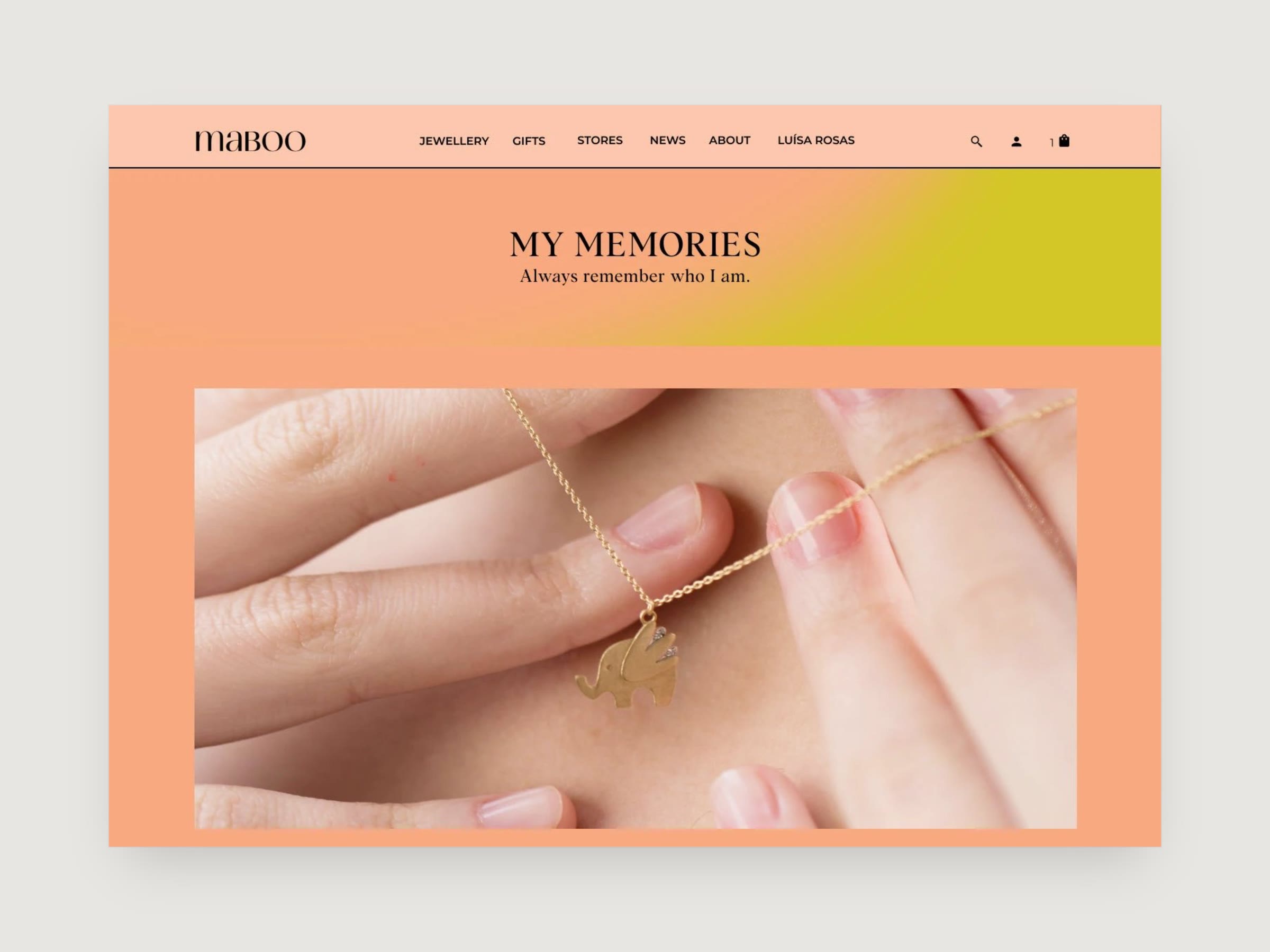
A fine-jewelry online store where every collection is built around the meaning behind the pieces. I designed the collection landing pages, the product grid and the component library, in a warm palette of coral, peach and chartreuse.
Problem
Each collection stands for something: memories, peace, protection. The collection pages had to tell that meaning first and lead to the pieces after, and each needed a mood of its own without looking like a different shop.
Process
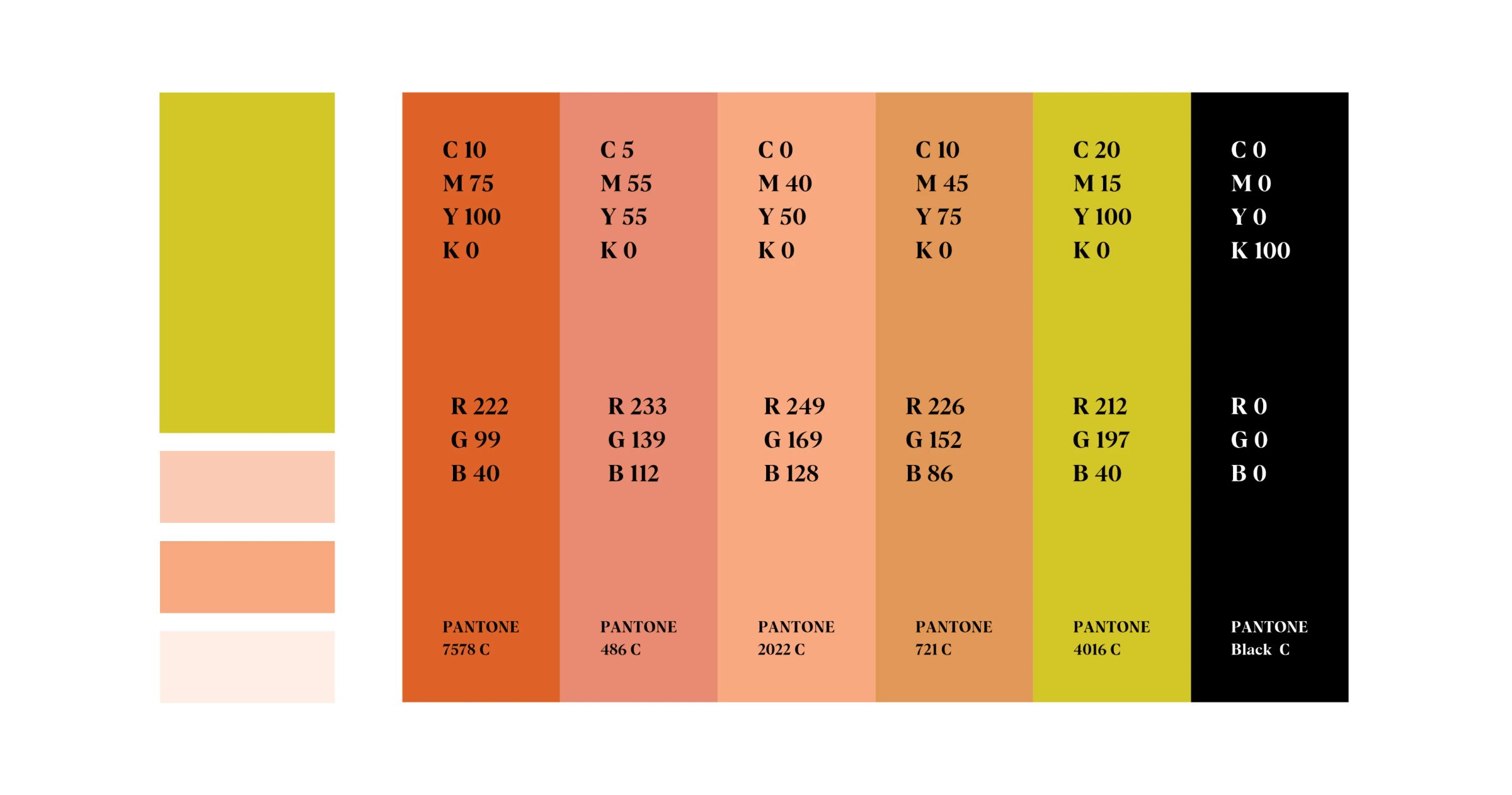
The palette does most of that work. Chartreuse, peach, coral and terracotta sit close enough to mix freely, so each collection can take a different lead colour and still belong to the same family.
Colours
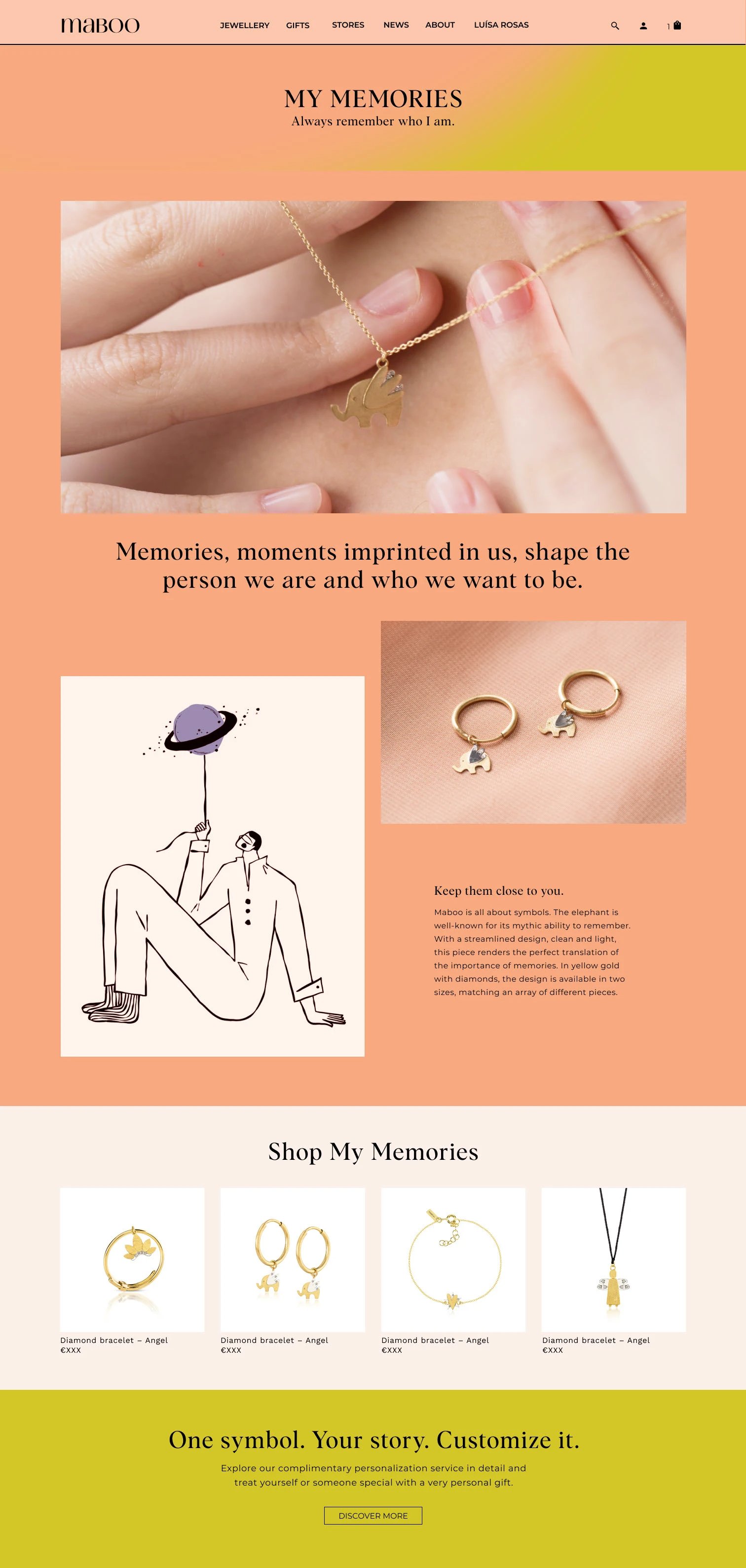
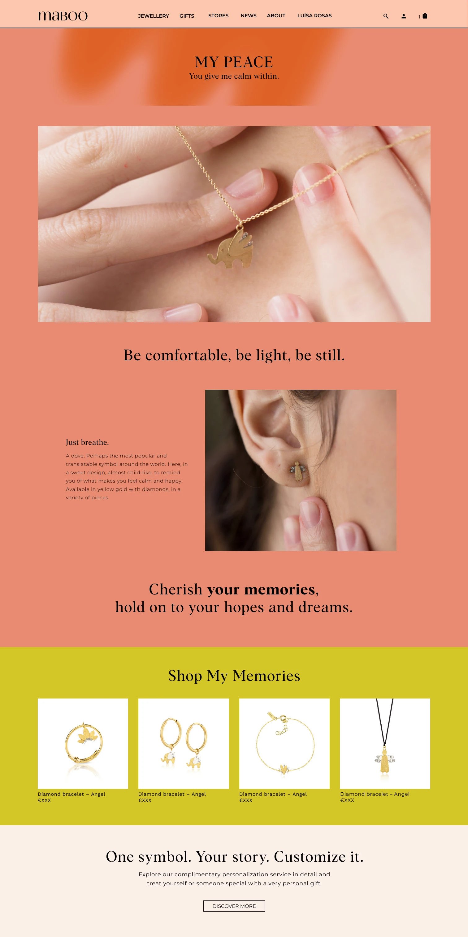
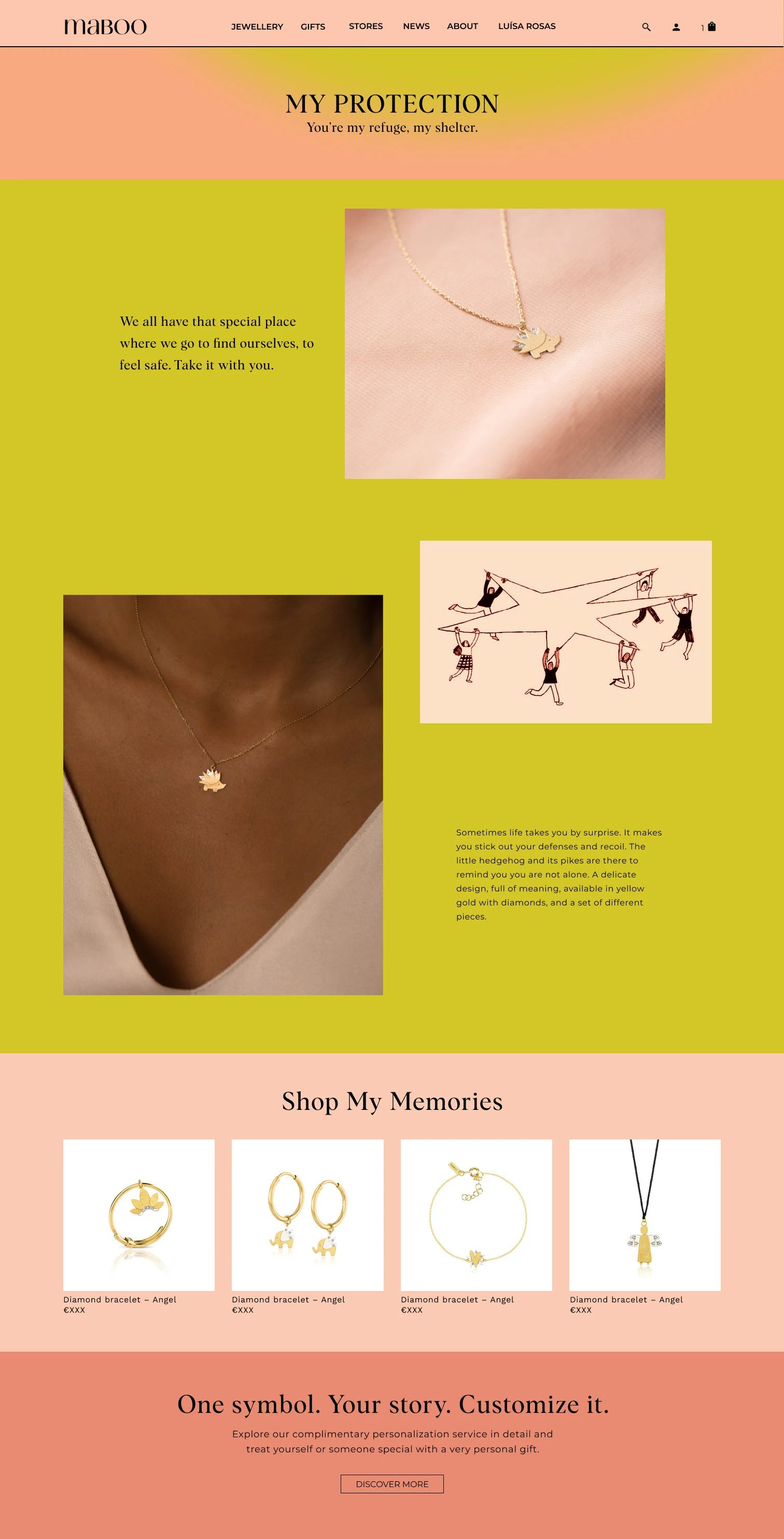
Every collection page is built the same way: the name and a single line, a large photo, the story with an illustration, a grid of the pieces, and a banner for the personalisation service. Scroll inside each preview to see the full page.
My Memories
My Peace
My Protection
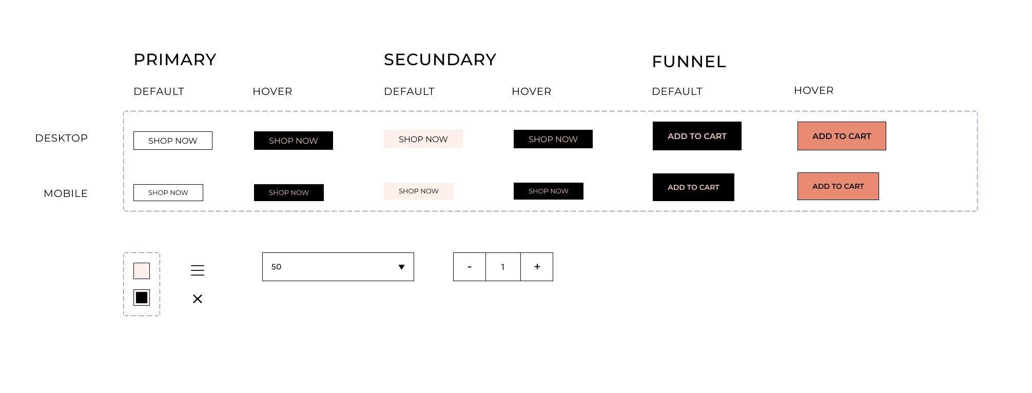
A small set of components keeps the shop consistent: primary, secondary and buying buttons for desktop and mobile, a quantity selector, a dropdown and checkboxes.
Components
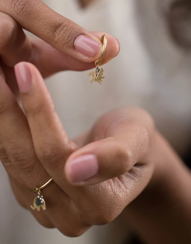
The photography stays close to the hand, so the small pieces are shown at the size they are worn.
Photography
Outcome
Three collection pages, My Memories, My Peace and My Protection, built from one layout, one palette and one set of components, so a new collection can be added in the same way.