Heritage Jewelry Store
Overview
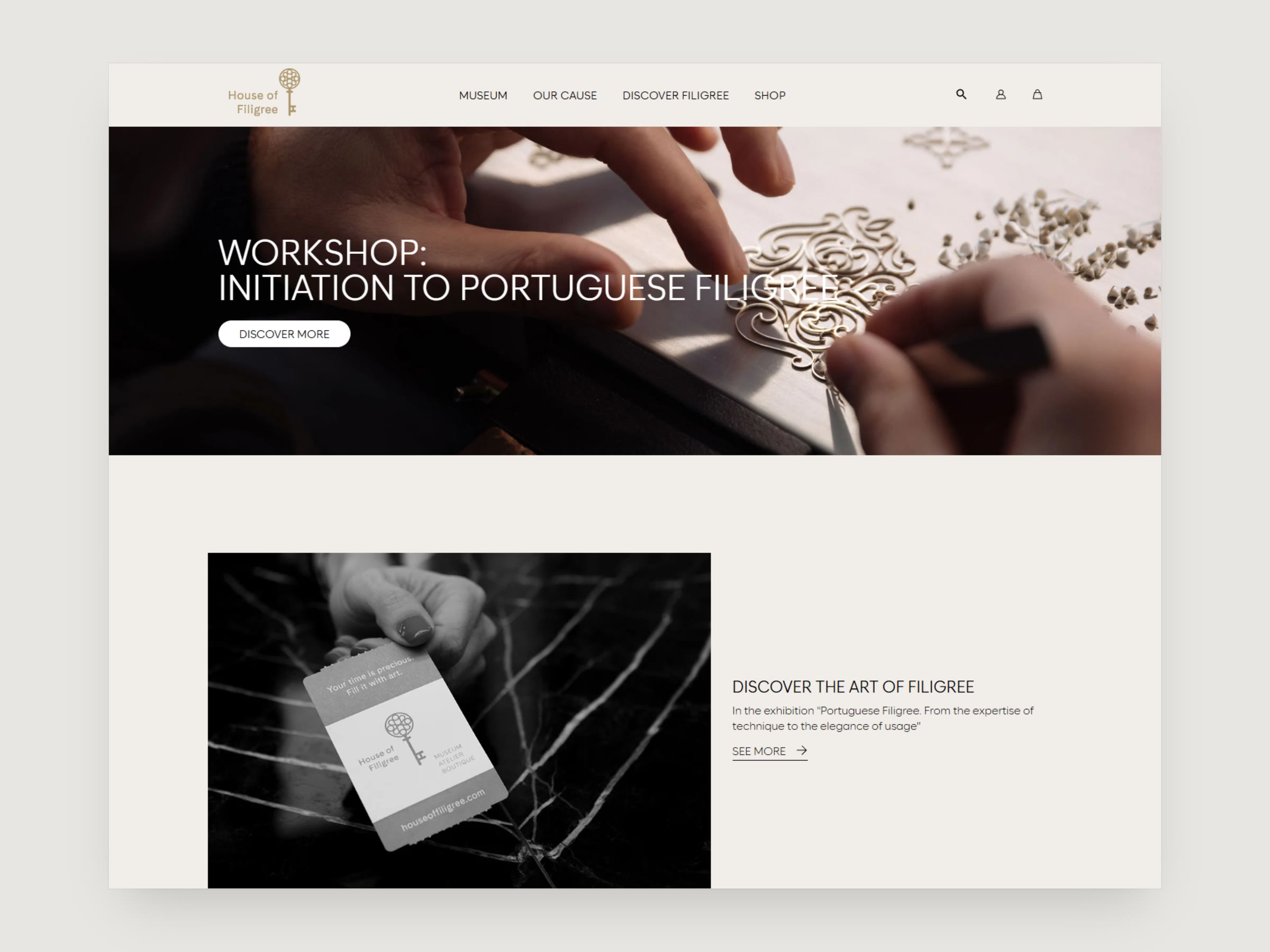
An online store for Portuguese filigree jewelry. I designed the storefront, the collection and gift-shop pages, product pages and the basket, with a colour palette taken from the craft itself: aged gold, old photographs and dark wood.
Problem
The website has two jobs. It has to tell the story of filigree and invite people to the museum and its workshops, and it has to sell pieces and gifts from the shop. The design needed to hold both without the store pushing the craft aside.
Process
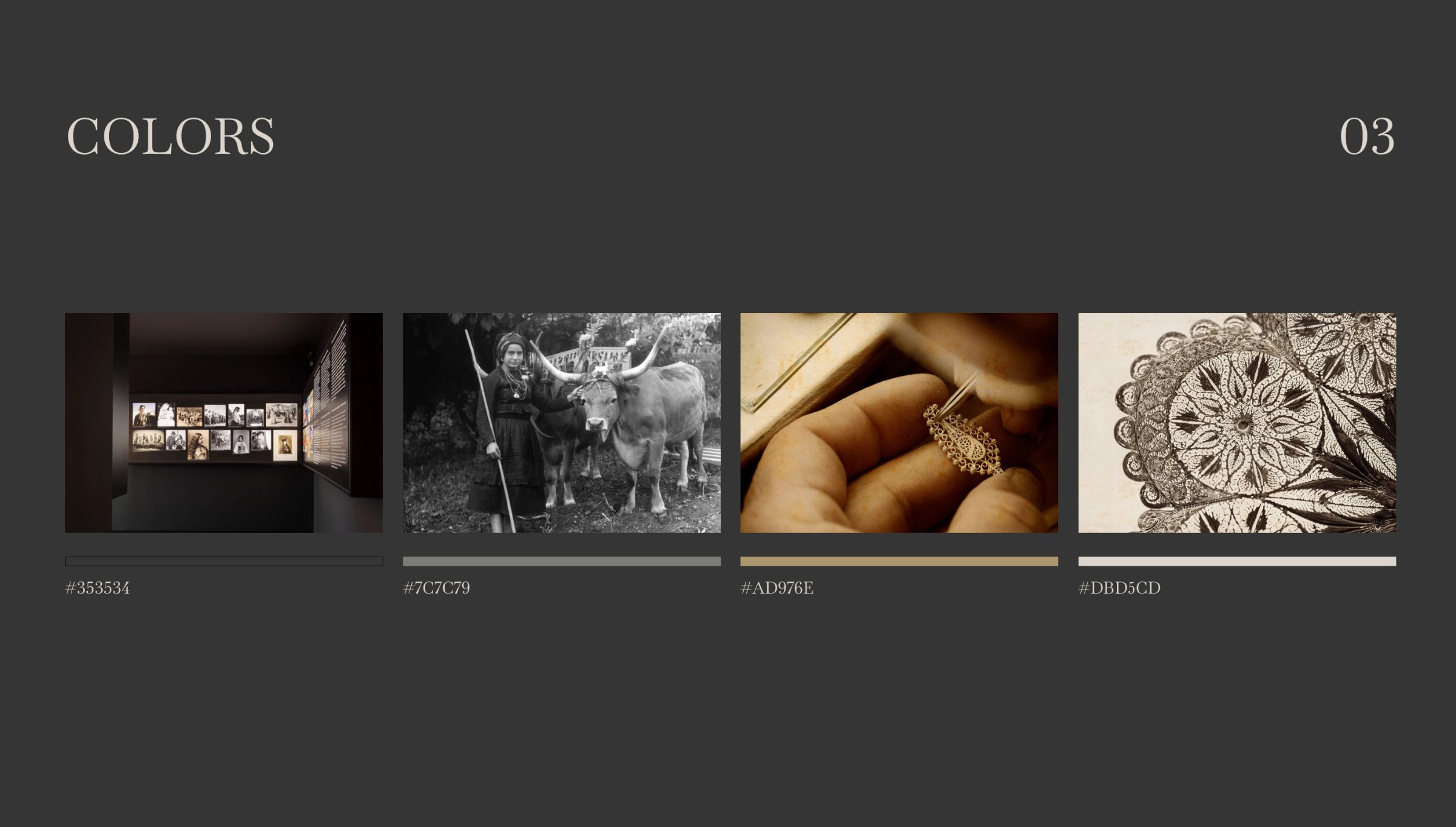
I started with the palette. Its four colours come from the craft itself: the dark of the workshops, the grey of archive photographs, the gold of the pieces and the cream of the lace-like patterns.
Colours
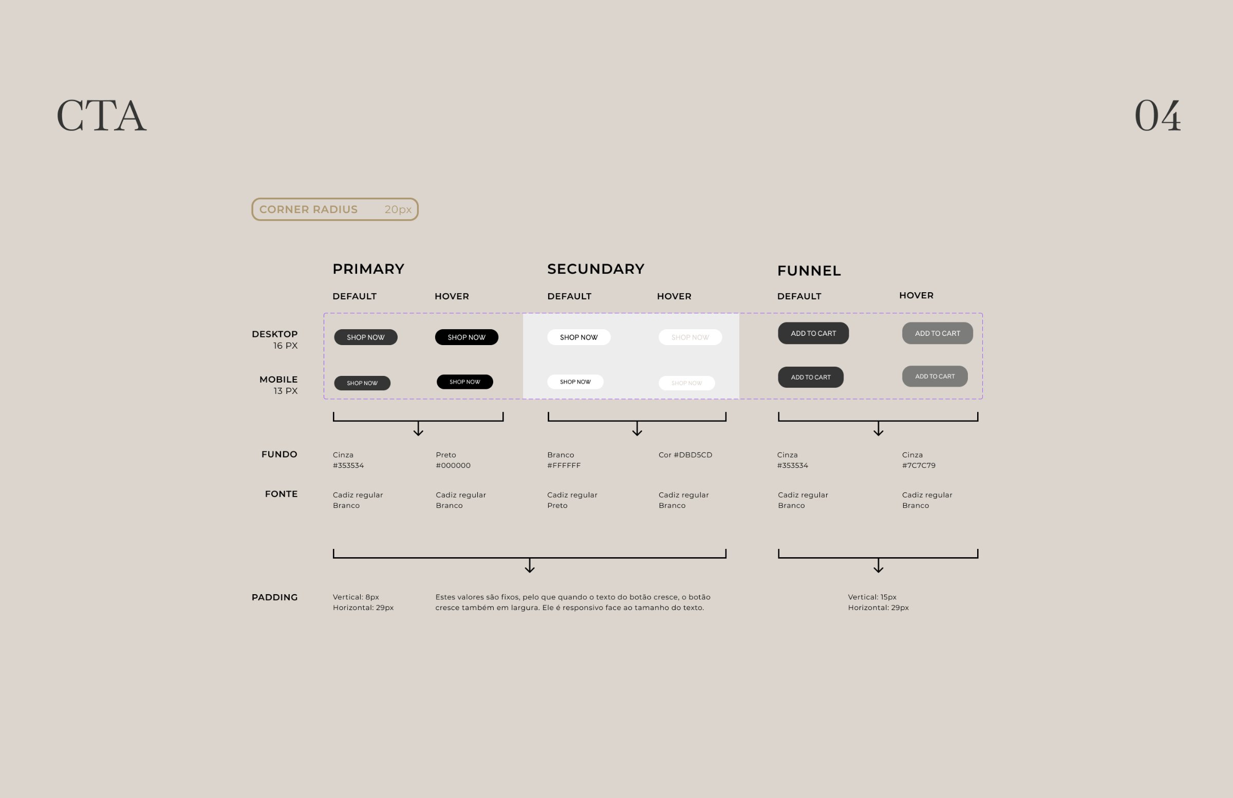
The buttons follow from it: primary, secondary and a funnel button for buying, each drawn in its default and hover state so they behave the same everywhere in the shop.
Buttons
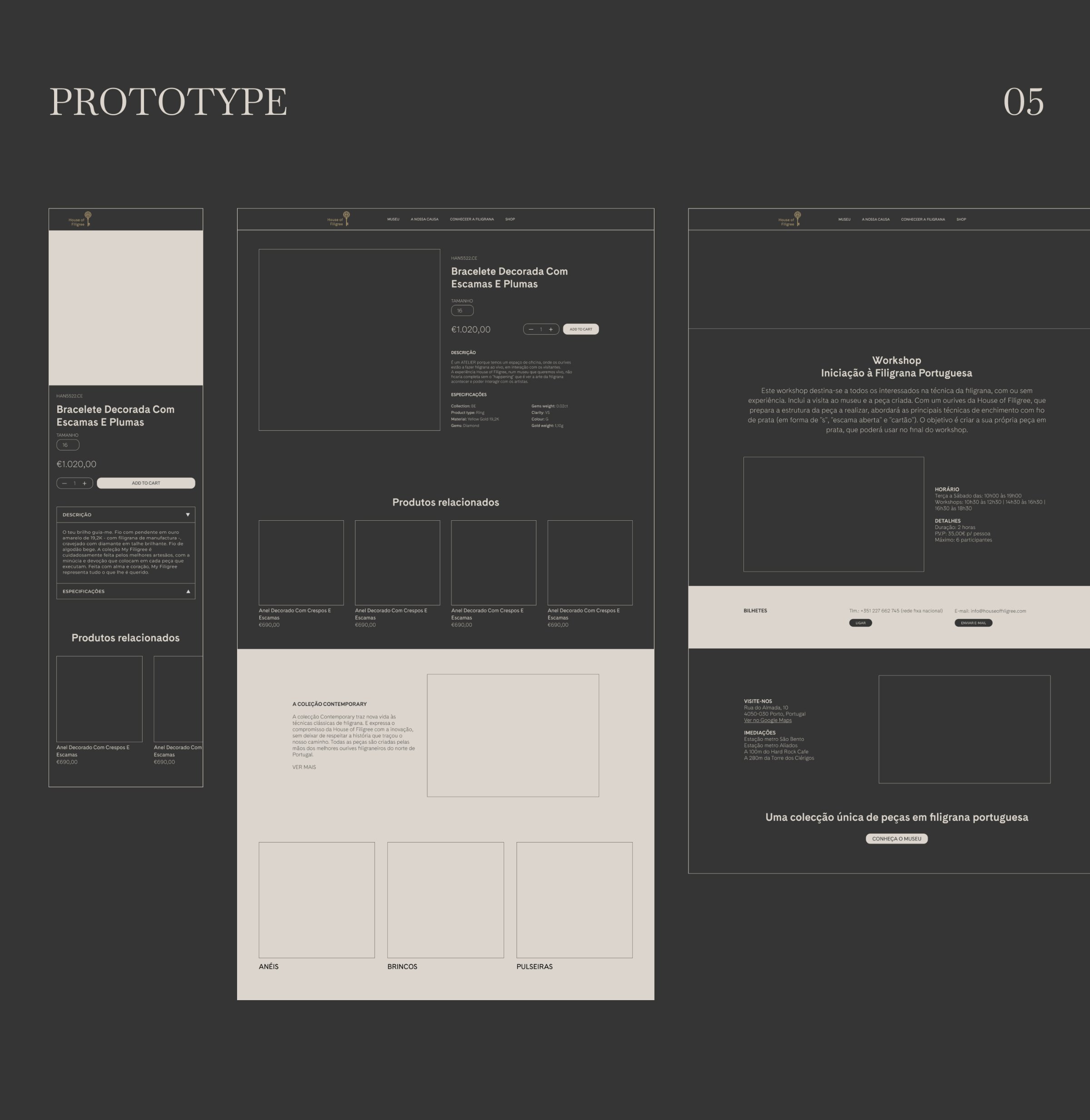
Before any visual design, I laid out the homepage, the collection and the product page as wireframes, to settle what goes where. Scroll inside each preview to see the full image.
Wireframes
The homepage leads with the craft: a workshop banner, the exhibition, the history of filigree and an invitation to visit the museum, with news at the end. It was designed for desktop and mobile together.
Homepage
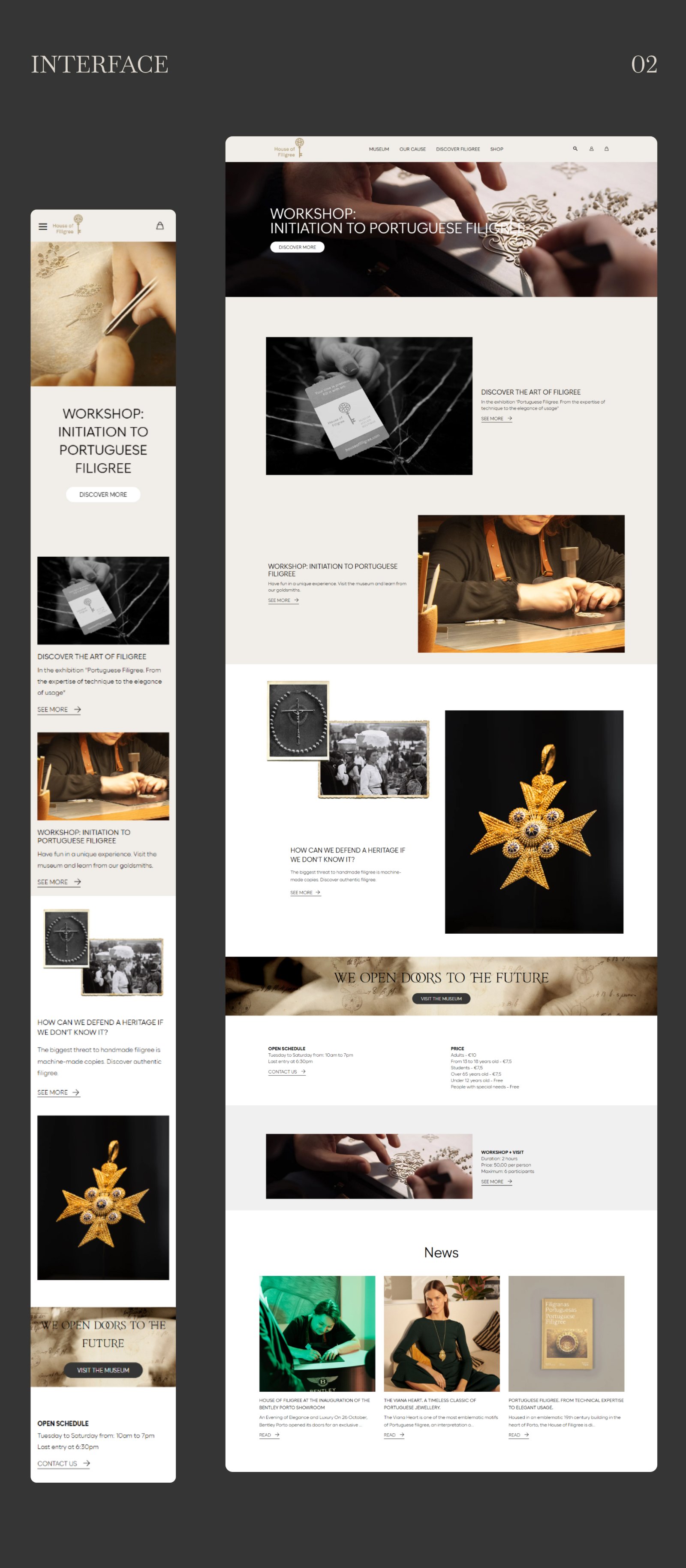
The product page keeps the buying part simple: photos, price and one button, then related products, and below them the stories that link back to the craft.
Product page
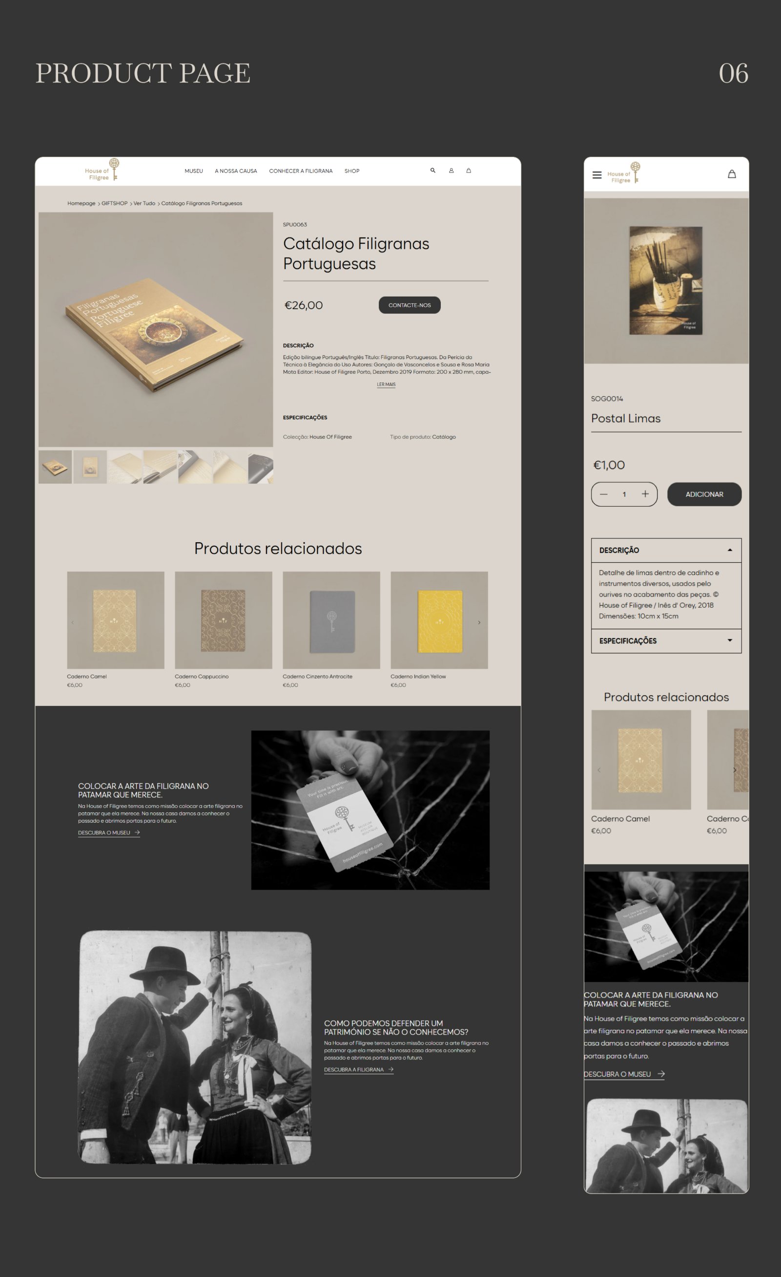
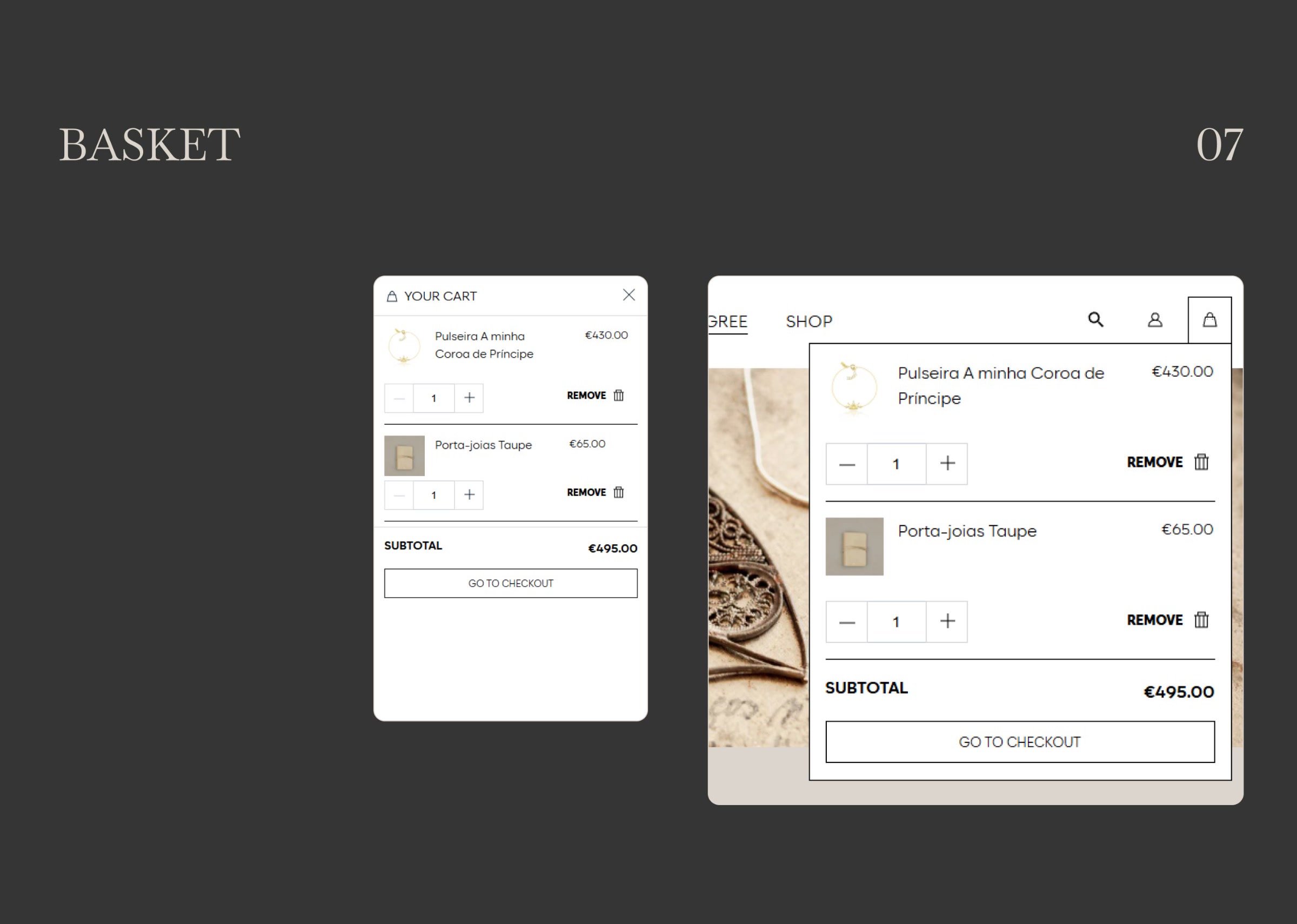
The basket slides in from the side, so adding a piece never takes the shopper away from the page they were on.
Basket
Campaign photography shows the pieces worn, and sets the warm, quiet tone the rest of the shop follows.
Photography

Outcome
A storefront design for desktop and mobile, covering the homepage, the product page and the basket, with a palette and a set of buttons that the rest of the shop can be built from.