Notes & Planner App
Overview
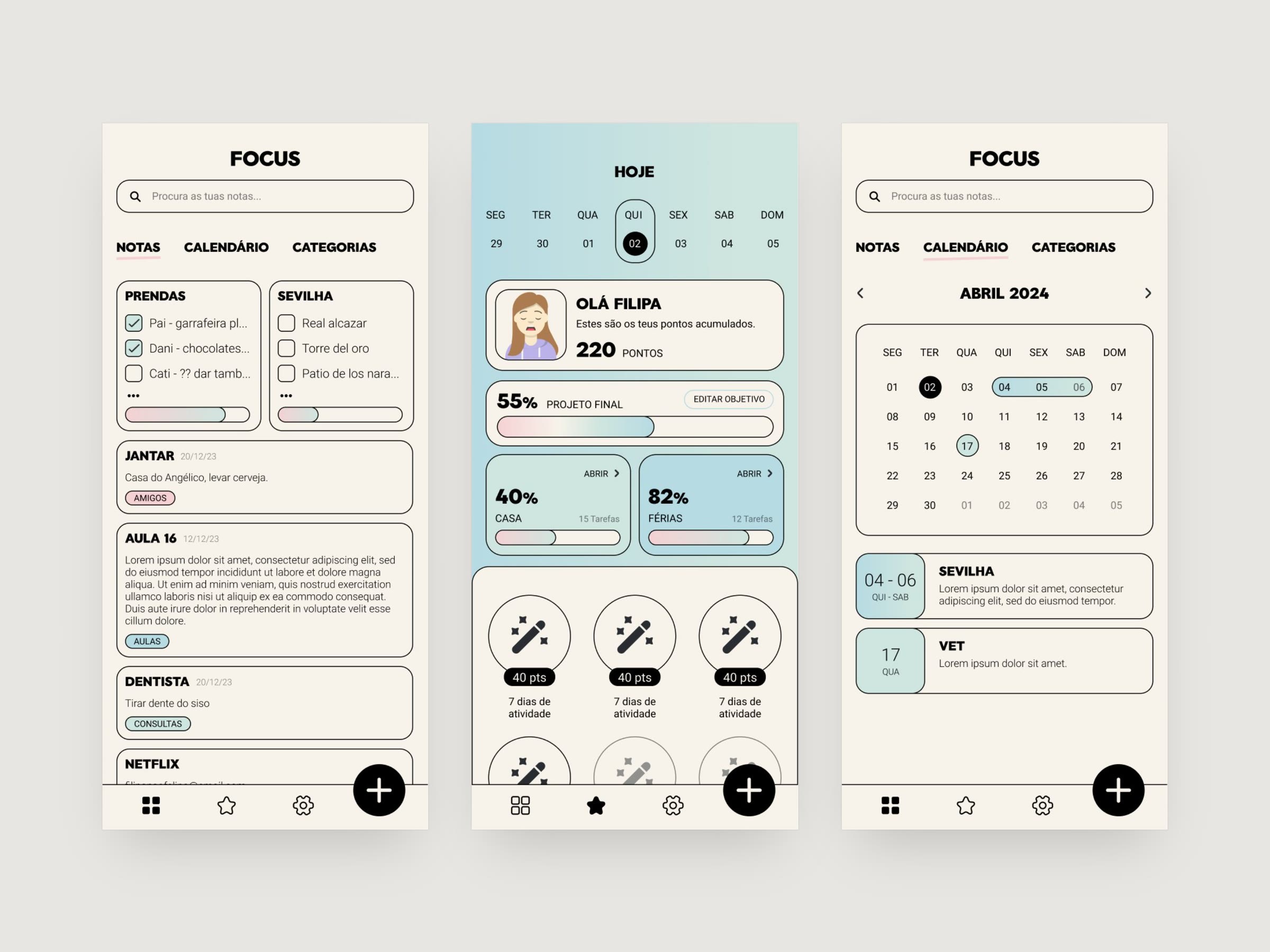
Focus is a notes and productivity app, designed in Portuguese as a course project. It brings notes, lists and a calendar together in one calm place, so the week ahead never catches you off guard.
Problem
How often do you feel anxious about the week ahead? Not knowing your commitments for the next few days, or having nothing planned for that trip in three days. Notes, appointments and to-dos end up scattered, and it's easy to lose track of what matters.
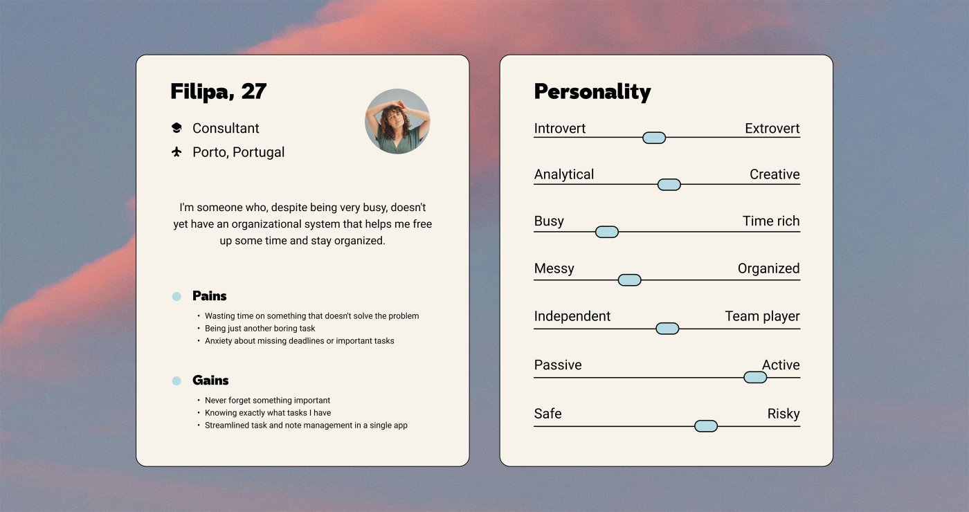
I built the project around a persona, Filipa, a 27-year-old consultant in Porto. She is busy and a little scattered: she wants a simple system to free up time, stop worrying about missed deadlines, and keep her notes and tasks in one place.
Process
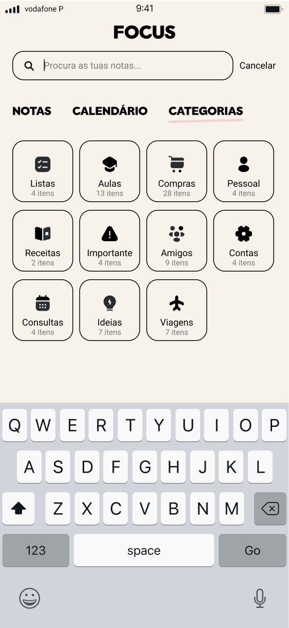
The answer is one app for notes, lists and the calendar. Everything is sorted into categories and can be found with a single search, and a progress screen turns finished tasks into points and goals, so staying organised feels rewarding.
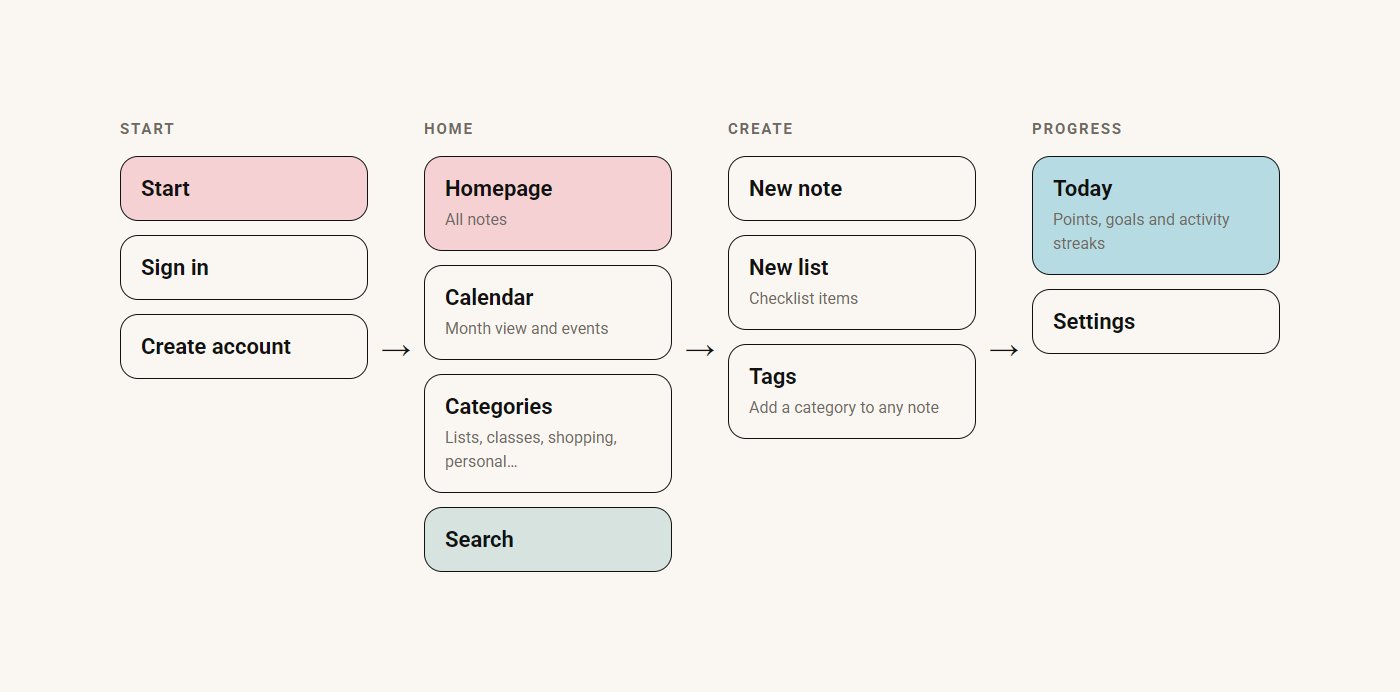
I mapped the app around four areas: getting started, the homepage with its calendar, categories and search, creating notes and lists, and a progress screen.
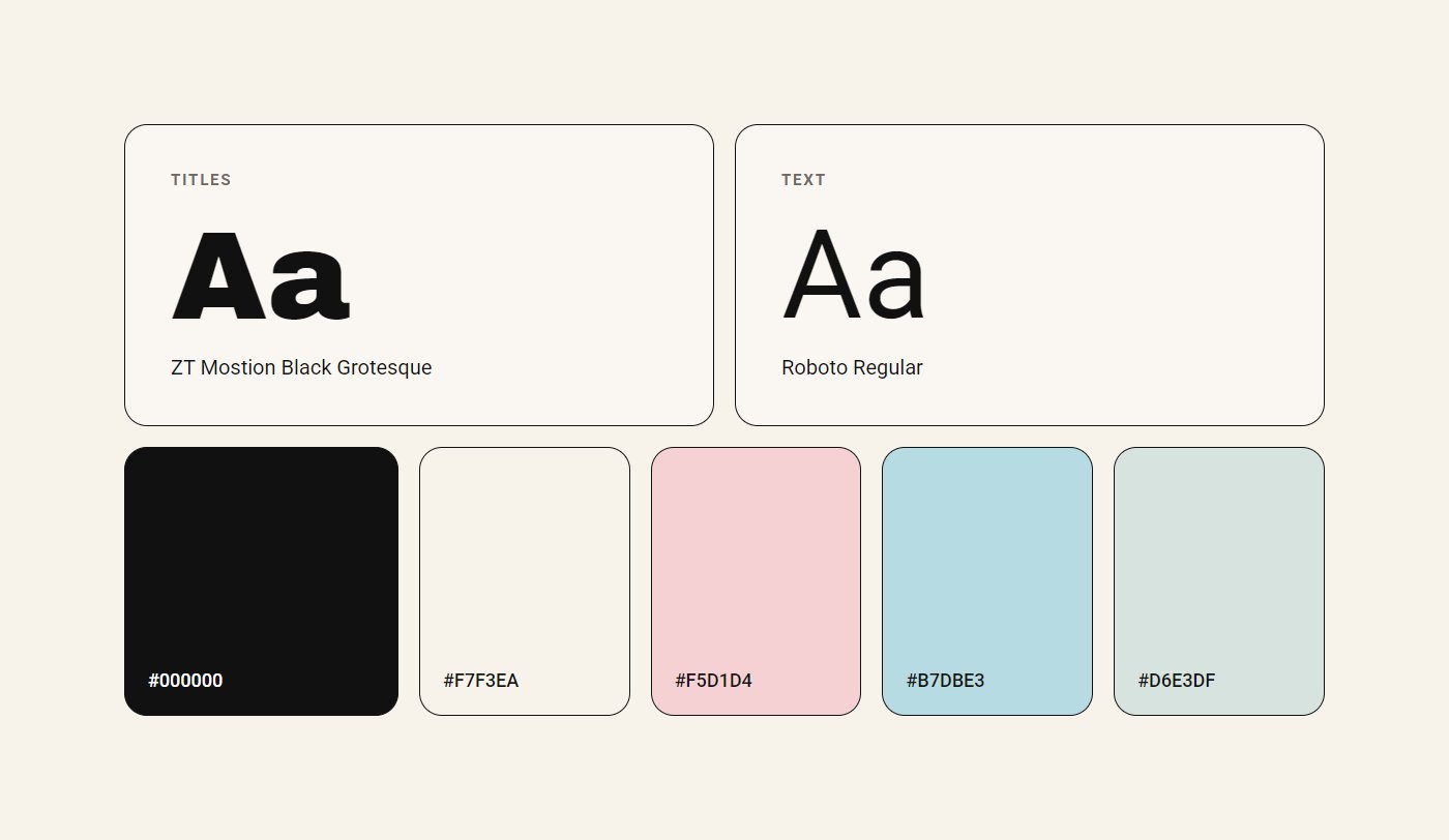
The visual identity pairs soft pastels with bold black type: a heavy black grotesque for titles and Roboto for everything else, on a warm cream base. Pastel blue, pink and mint mark categories and progress without adding noise.
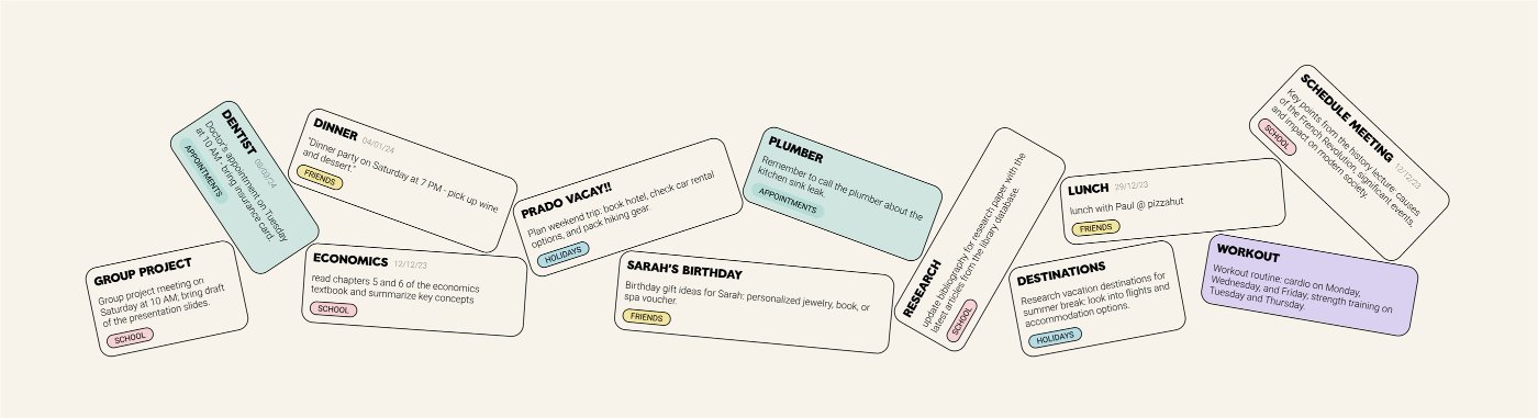
The homepage shows every note at a glance. A note or a checklist is one tap away, and tags sort it into the right category as you write.
Notes
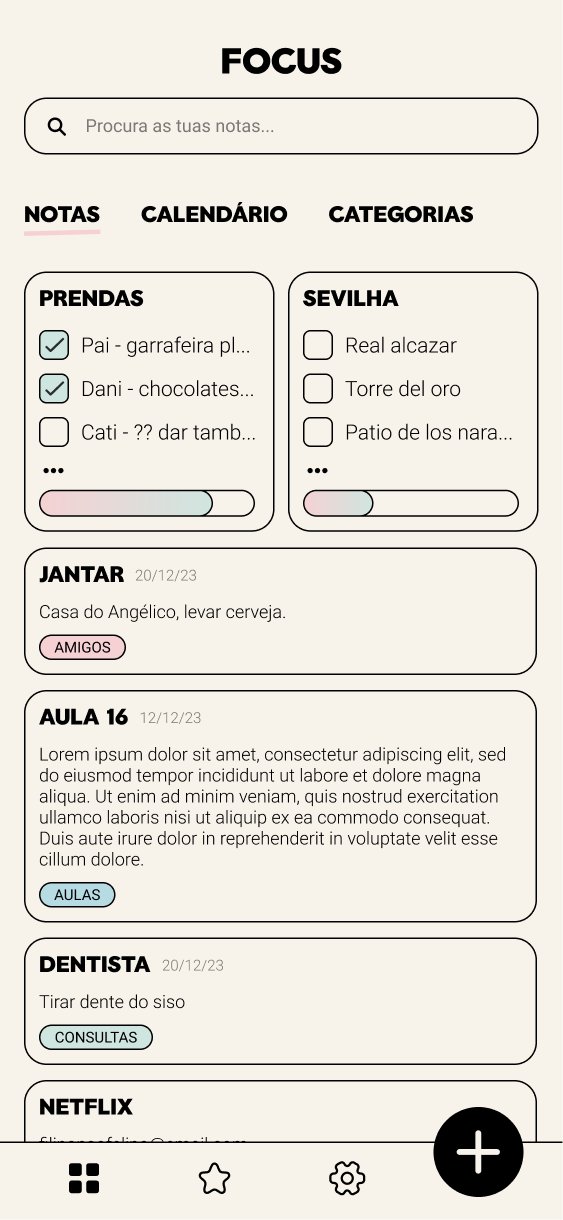
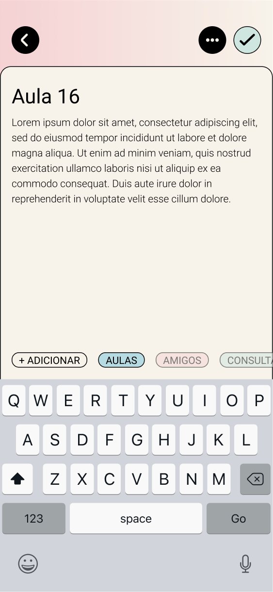
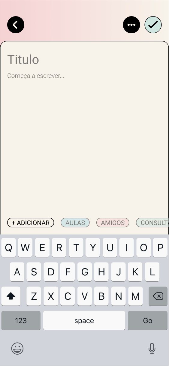
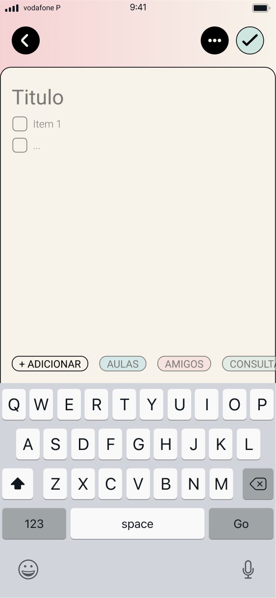
The calendar shows what's coming up, categories group notes by area of life, and search reaches everything from one bar.
Organise
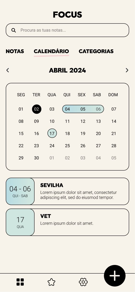
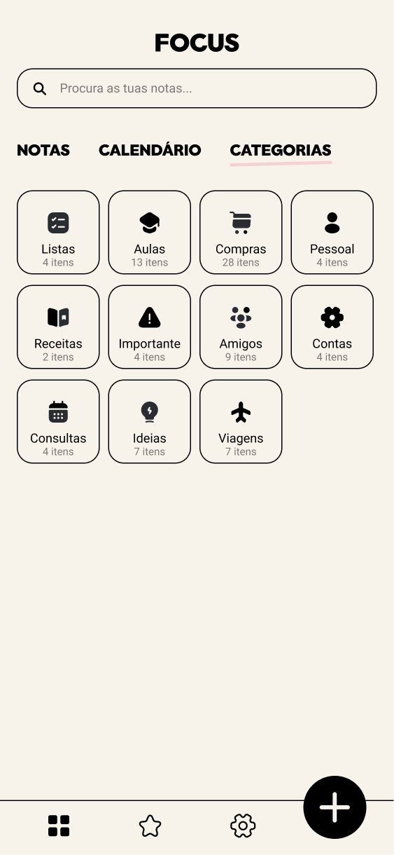
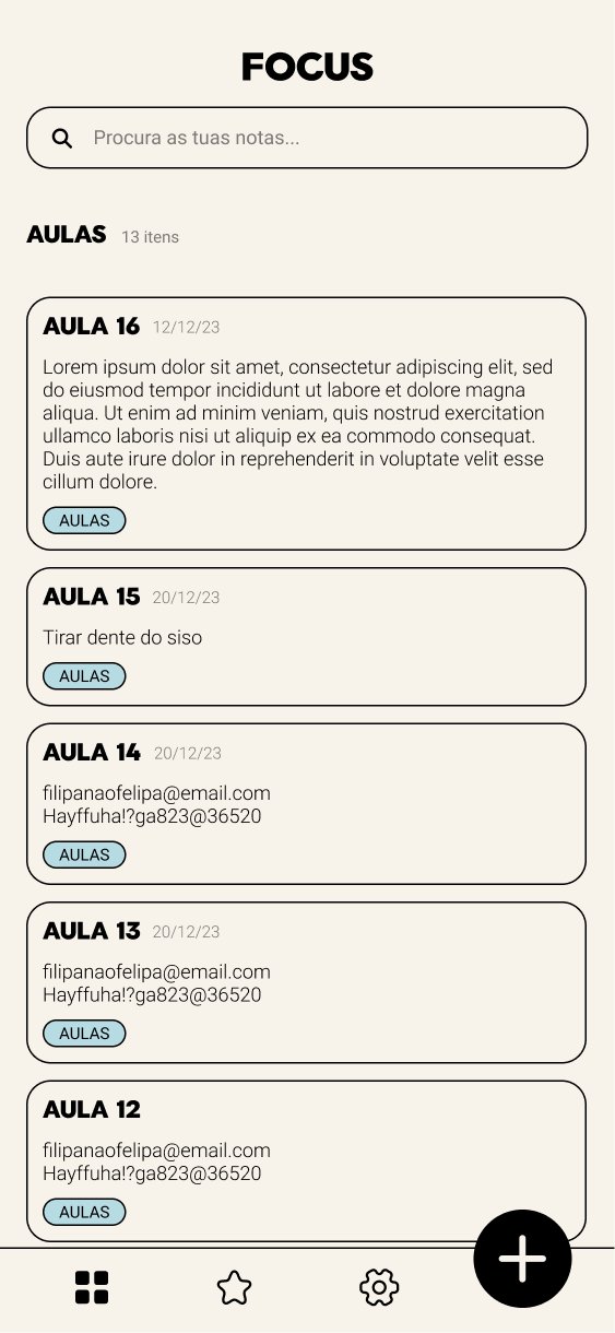
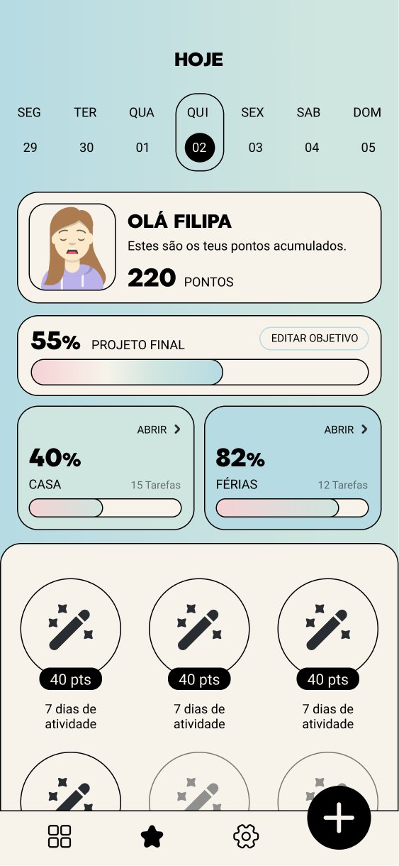
Getting organised should feel like a small win. The Today screen greets Filipa with her points, the progress of her goals and her activity streaks, turning a to-do list into something she wants to come back to.
Progress
Outcome
The result is a complete mobile app design that gives Filipa everything she needs to plan in a single app. It answers each of her gains: never forgetting something important, knowing exactly what tasks she has, and managing notes and tasks in one place.