Challenger Research
Overview
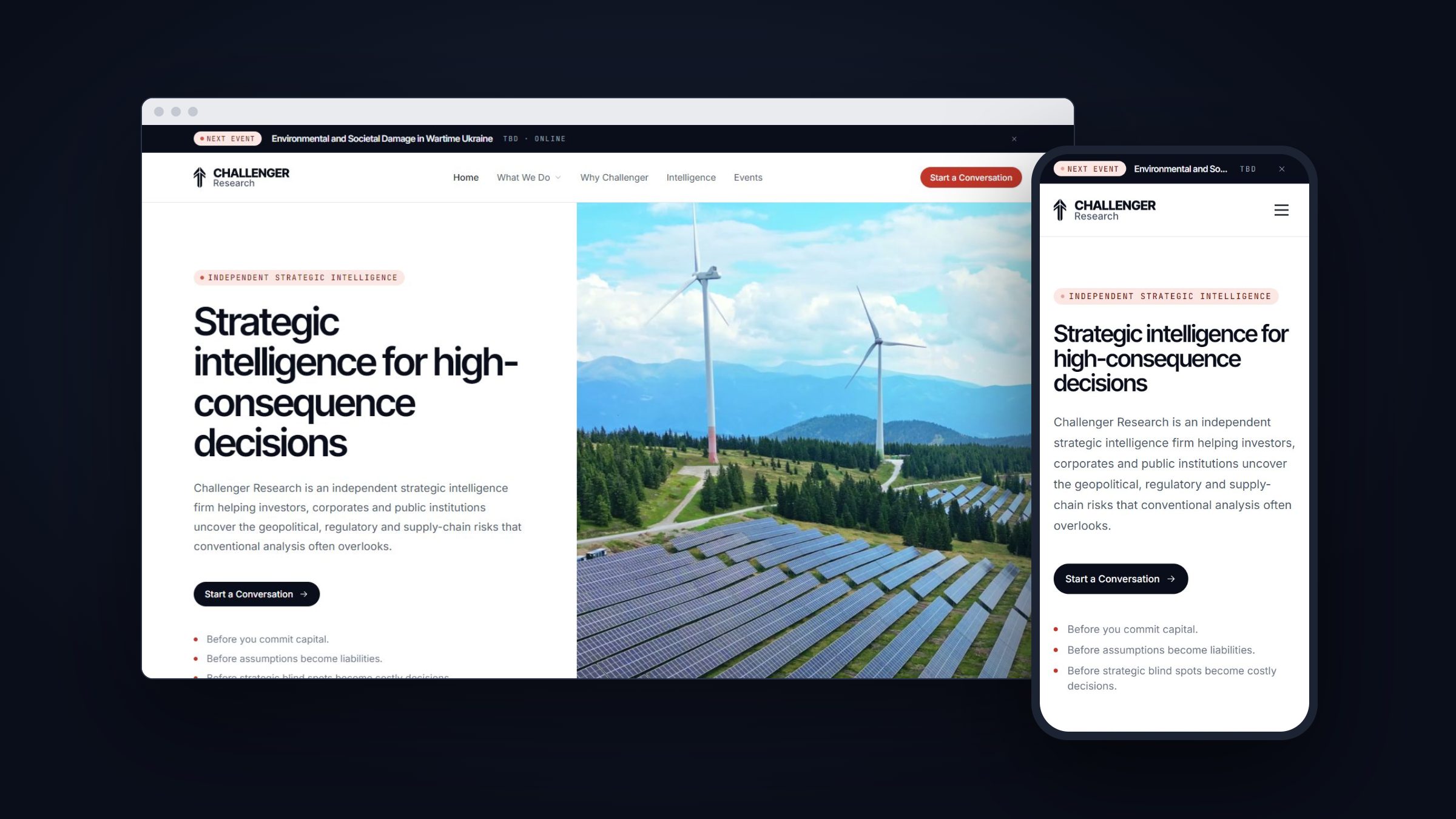
Challenger Research (opens in a new tab) is an independent strategic intelligence firm based in York, UK. It helps investors, corporates and public institutions understand the geopolitical, regulatory and supply-chain risks behind their decisions. I created a new design system for the brand, designed and built the whole website, and took it live, all in 22 hours and working entirely in Claude Code.
Problem
Challenger's work spans three practices, seven domains, published research, events and a membership, and the website had to make all of it clear to a senior, demanding audience. The site needed to be reorganised around the firm's three intelligence practices, give events more prominence and lead every page to a conversation with the team. It also needed one consistent visual language that could carry long-form research and keep working as new reports and events are added.
Design system
The project started with the system. The direction is sober and editorial, closer to a serious policy quarterly than a tech startup: ink on paper, with a single signal red reserved for what matters, like calls to action and live events. Inter Tight carries headlines and interface, and JetBrains Mono is used for eyebrows, metadata and report references, with hairline rules giving the pages a print-like rhythm.
I documented it as a living page: brand, colour, typography, spacing, radius and elevation, then the components (buttons, badges, inputs, cards and navigation) and the patterns built from them, such as capability cards, the insight feed, pull-quotes and the CTA band. Every page of the site is assembled from these pieces. Scroll inside the preview to see the full system.

Website
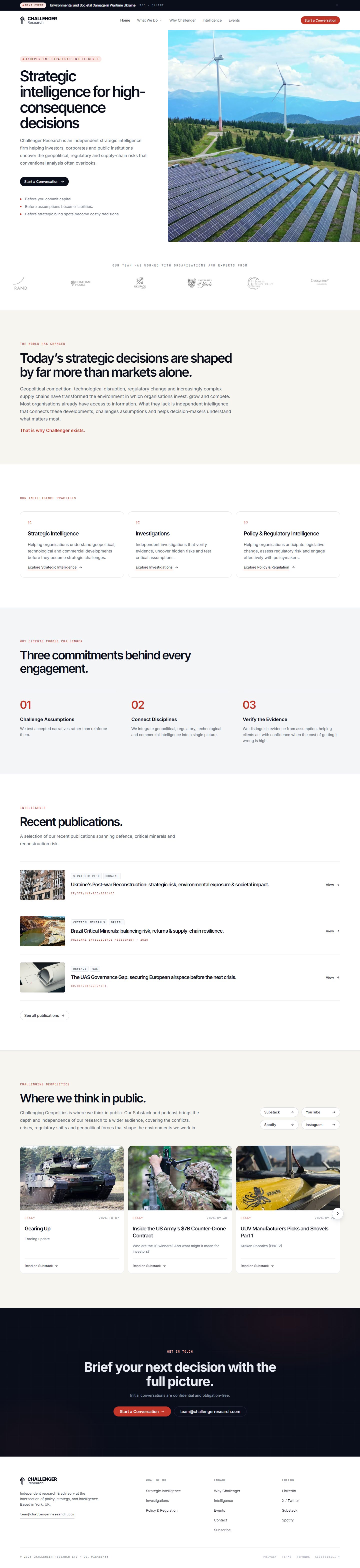
I then designed and built the website for desktop and mobile on top of the system. The homepage leads with what Challenger does and why it matters, introduces the three practices (Strategic Intelligence, Investigations and Policy & Regulatory Intelligence), each with its own page, and surfaces the latest publications and the Challenging Geopolitics feed. Events moved into the main navigation, with a bar at the top of every page announcing the next one, and "Start a Conversation" became the single call to action across the site.
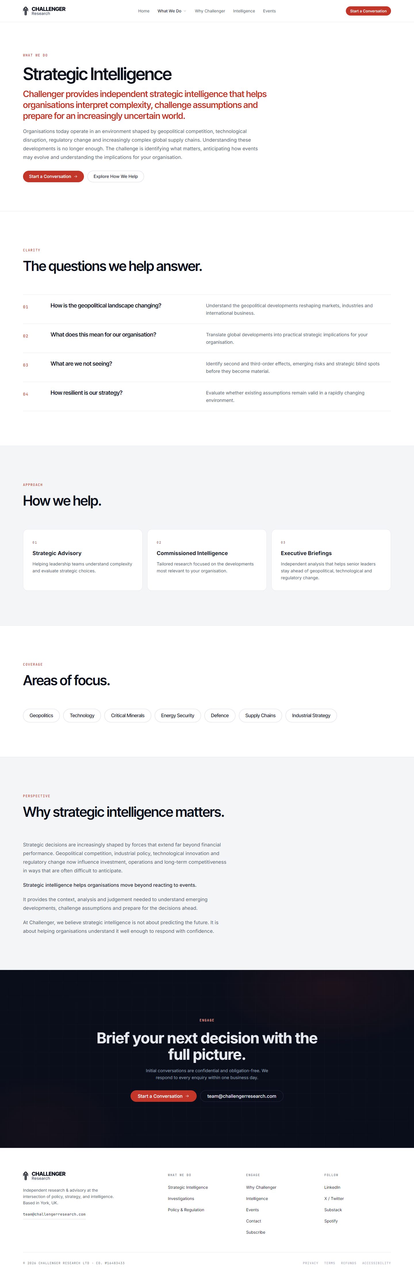
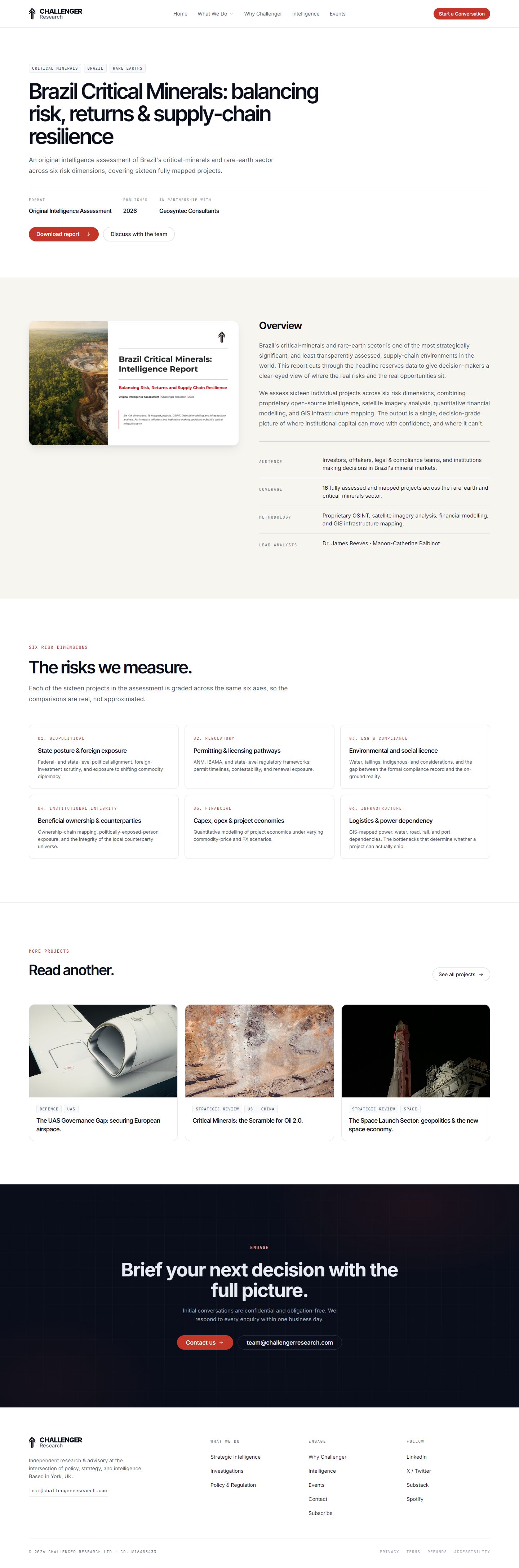
Because I built it in Claude Code, design decisions went straight into production HTML and CSS, so most of my time went into the design itself: reviewing every breakpoint, refining details and running an accessibility pass. Here are a few of the pages. Scroll inside each preview to see the full page.
Homepage

Strategic Intelligence

Report

The rest of the site, including Why Challenger, the Intelligence library, Events and Membership, is live.
Visit challengerresearch.com (opens in a new tab)Outcome
The site is live at challengerresearch.com (opens in a new tab). In 22 hours, Challenger Research went from brief to a launched website with its own design system, which now gives the team a consistent way to publish new reports and events.